

Dashboards
& analytics
Your KPIs live in twelve hand-updated Excel files. By the time you read them, they're already wrong. We replace the export with a dashboard that updates itself.
The problem isn't that you lack figures. It's that you read them too late, and that nobody around the table reads exactly the same ones.
Friday night, or real time.
The manual export
- A weekend lost copy-pasting five tools into one master file.
- Figures already stale by the time management opens them.
- A finance truth that contradicts the sales truth.
- A drift discovered at the close, a month too late.
The dashboard that keeps itself current
- Sources refresh on their own, with no Friday intervention.
- KPIs at D+1, read as-is by everyone.
- One definition per indicator, shared across finance, ops and sales.
- A commented alert the moment a figure leaves its range.
Three figures measured on the steering systems we have rewired, at constant scope.
- J+1 KPI freshness vs D+15
- −90% time in manual exports
- 1 source of truth instead of twelve
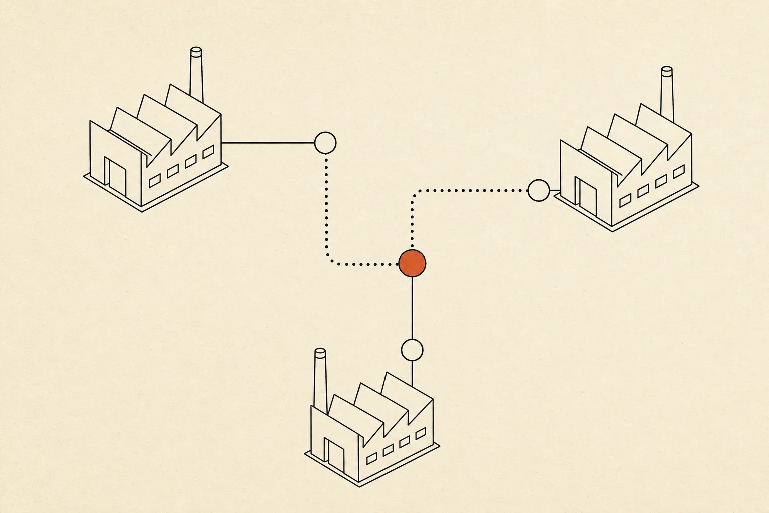
From sources to the living board.
Source connection
+ connectors
Single-definition KPIs
+ data layer
Real-time dashboard
Drift alerts
+ alerting
Caserne, industrial SME.
One single truth shared across three sites.
Before adding headcount, we wanted to see what was really happening between sites. The shared view settled the debate in one meeting.
Operations leadership, Caserne
What powers the view.
| Category | Tool | Role |
|---|---|---|
| Reasoning model | Claude Sonnet 4.6 | Variance interpretation, trend commentary and reading of KPI movements. |
| Volume model | Claude Haiku 4.5 | Continuous cleaning, deduplication and normalisation of data. |
| Data layer | DuckDB · BigQuery · Snowflake | Data layer aggregating sources without forcing a heavy migration. |
| Rendering | Metabase · Looker · tableaux natifs | Visual rendering, dashboard sharing and role-based access. |
| Connectors | HubSpot · SAP · Stripe · Sage | Connectors to the business tools that already hold your figures. |
| Durable workflow | LangGraph | Refresh orchestration, failure recovery, human validation. |
Before we plug in.
Q.01 Do we need to migrate our tools for a unified dashboard?
No. We plug connectors into your existing tools, ERP, CRM, billing, spreadsheets. Data is aggregated into a lightweight layer, with no migration or replacement of your business software.
Q.02 Who decides a KPI's definition when teams disagree?
You do. We run the reconciliation workshop, document one definition per indicator, and you approve it. From then on everyone reads that figure, finance, ops and sales, with no debate on the method.
Q.03 How long until a first usable view?
3 to 4 weeks for a first view connected to your priority sources. We then extend indicator by indicator rather than delivering everything in one big project.
Q.04 Are access rights managed per profile?
Yes. Each profile sees its own view with its own rights: the board its macro, a team lead their scope. Sensitive data stays partitioned, the source stays single.
Fresh figures.
One single truth.
45 minutes. We look at where your KPIs live today, we price the highest-impact dashboard. If we have nothing to offer, we say so.